Charts
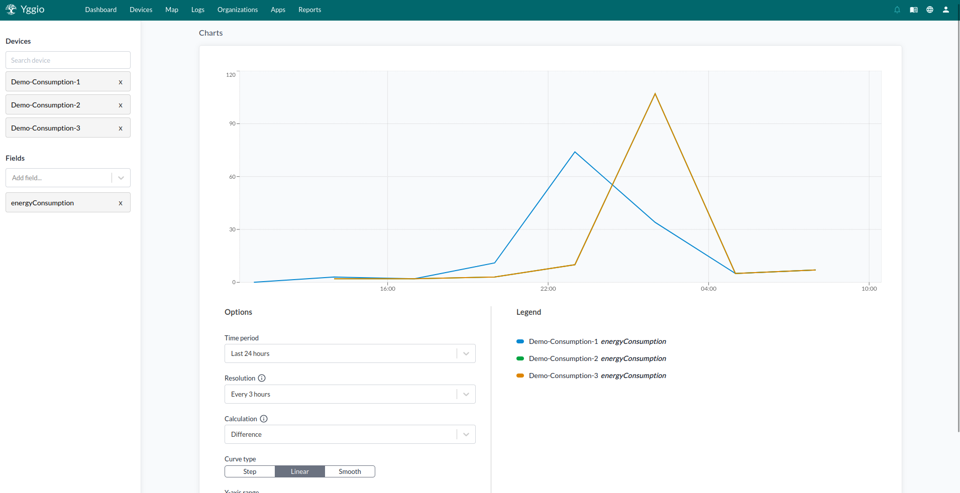
Charts display data over time for multiple devices, incorporating one or more fields. They can represent various types of data, such as temperature or the number of people passing. Note that charts created in the device menu cannot be saved. To compare time series data between devices and also different type of time series click on advanced in the top right.

Settings
The following aspects of the charts can be customized:
- Devices: The data from the devices will be shown.
- Fields: The types of values that will be displayed.
- Time Period: The duration for which data is displayed.
- Resolution: The time period from which each value will be calculated.
- Curve Type: The style of the line or curve used to represent the data. This can be step, linear, or smooth.
- Y-Axis Range: This can be set to automatic or start at zero.
Calculation types
A calculation is always applied over the resolution of the time period. The following calculations are available:
-
Mean: The average value of all data points during each resolution time period.
-
Time Weighted Mean: The average value, weighted by how long each value lasted.
-
Minimum: The minimum value recorded during each resolution time period.
-
Maximum: The maximum value recorded during each resolution time period.
-
First: The first value recorded in each resolution time period.
-
Last: The last value recorded in each resolution time period.
-
Count: The number of data points during each resolution time period.
-
Sum: The total of all values from the data points during the resolution time period.
-
Difference: The difference between the last value and the first value during the resolution time period. This is often used for metering analysis (e.g., last value of a month minus the starting value of the month).
-
Derivative: Calculates the rate of change over time (i.e., how quickly a value increases or decreases). An example, if the two most recent values are
15at timet1and20att2, and the time differencet2 - t1 = 5s, then the result is:20 - 15) / 5 = 1 per secondThis is a discrete derivative, which estimates the rate of change between two measured data points. In this case:
- The value increased from
15to20 - Over a time span of
5 seconds - So the average rate of change (slope) is
1 unit per second
You use derivatives any time you want to measure how fast something is changing, not just what its value is.
- The value increased from